As Canva has grown over the years, so has its complexity. Dozens of new features, overlapping surfaces, and inconsistent entry points, many users found it hard to know where to begin. Features like canva ai, magic media, and templates were scattered across different parts of the product. Especially on mobile, space was tight and discovery felt frustrating.
Wonder Box brought everything together. One simple box for searching, generating, and exploring. Consistent across surfaces, simple to use, and an easy way to get started with ai.
4 months
Time
5+
User Tests
+33%
AI Usage
50%
MAU
$25M
ARR
my role
- led end-to-end UX for search, filters & AI entry and interoperability
- built working prototypes (using real data) for founder feedback
- collaborated with researchers on several studies
- regularly held checkins with founders
- ran design reviews across 4+ teams
- helped to define patterns used across surfaces
how it works
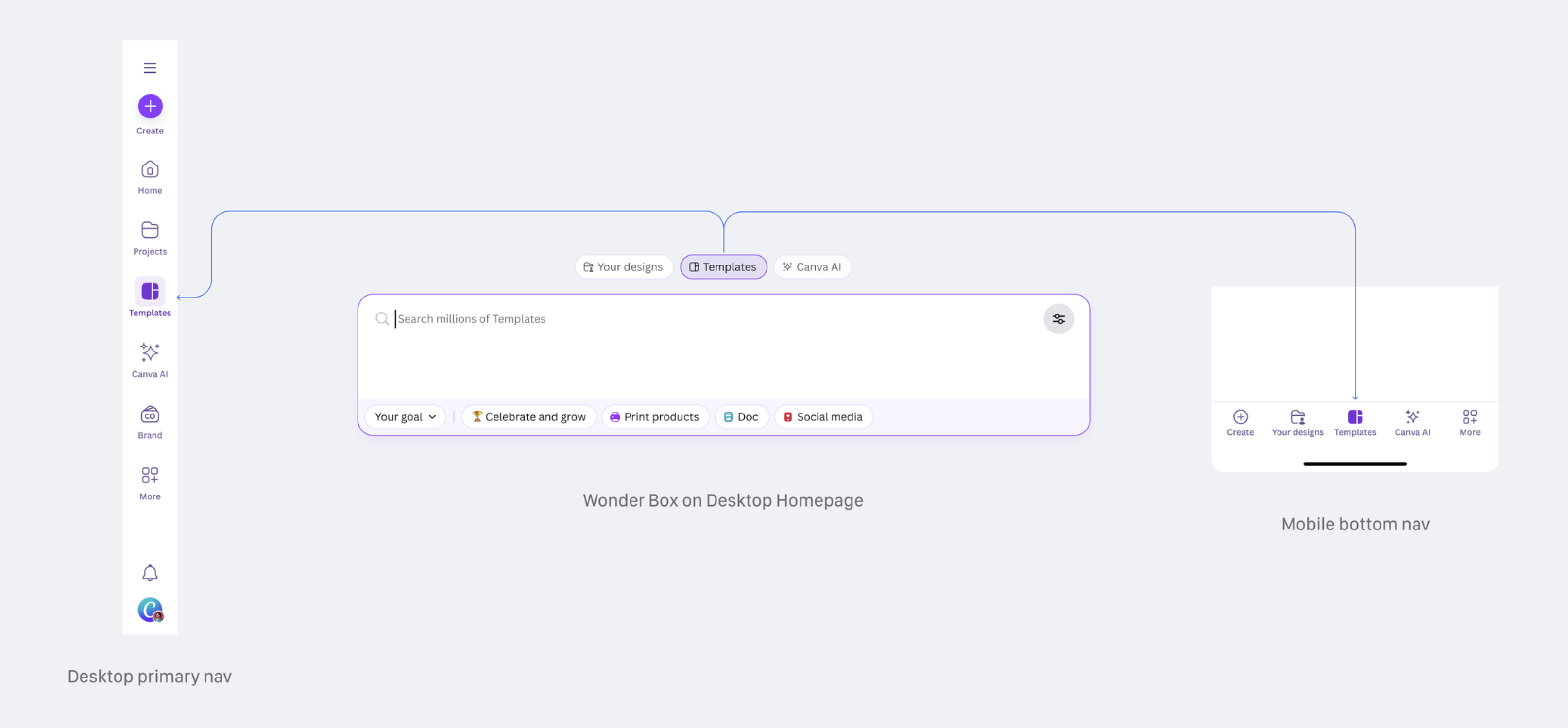
one box, many surfaces
wonder box lives across canva on the homepage, in the editor, and in canva ai. same entry, different contexts.
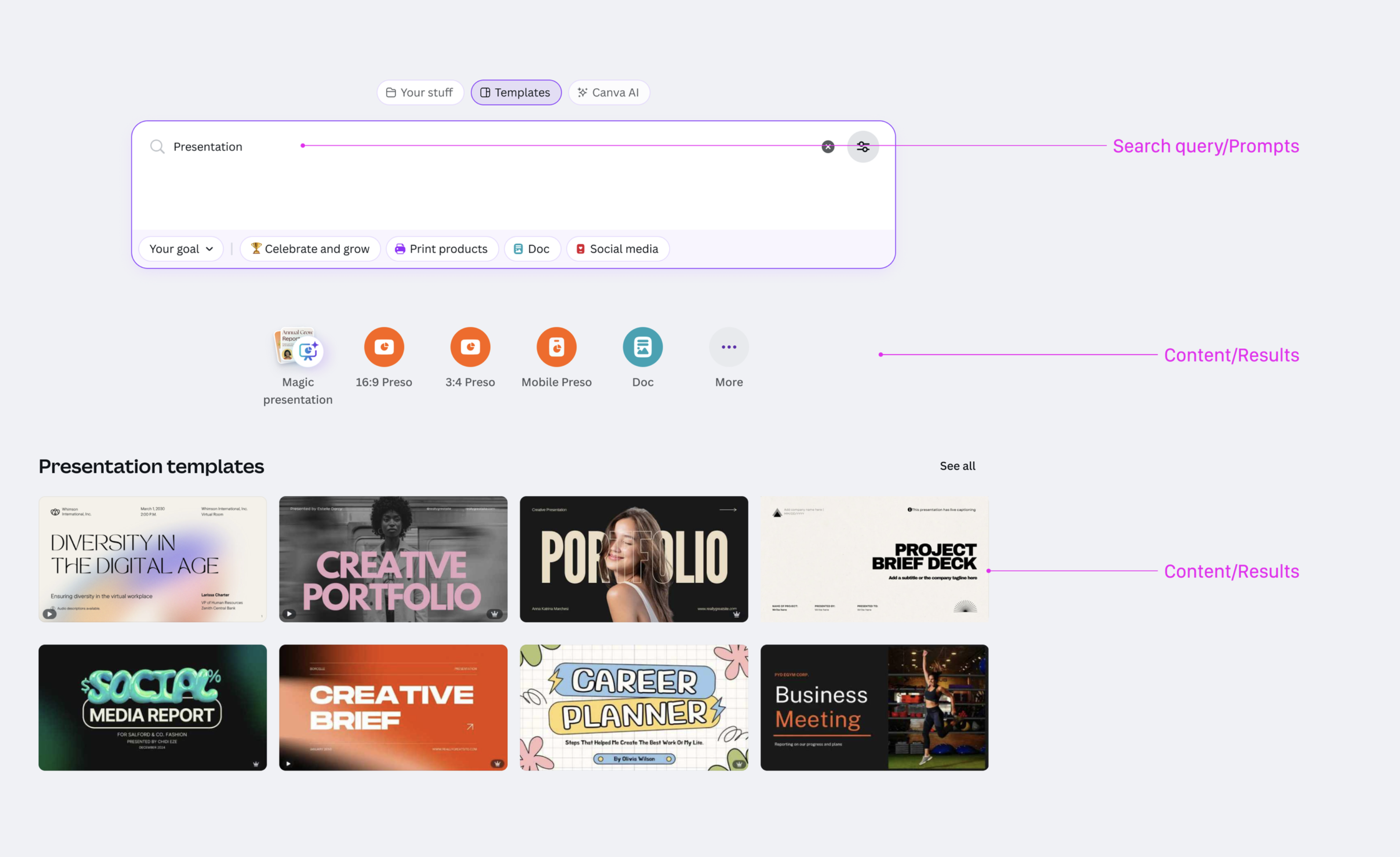
search or create
users can type what they want to find or generate templates, designs, images, videos, and docs. all from one location.
filters that think
adjustments update based on what users need—format, style, use case—showing just enough to guide.
adaptive layout
designed to fit every screen. fast on mobile, fluid on desktop, optimised across devices.
consistent, but smart
looks the same everywhere. adapts quietly behind the scenes to show what matters, where it matters.
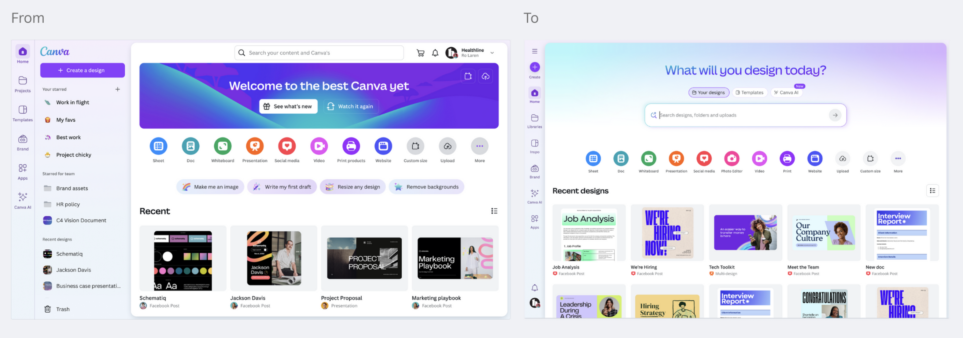
simplifying the ia and streamlining entry points
simple but clear content hierarchy
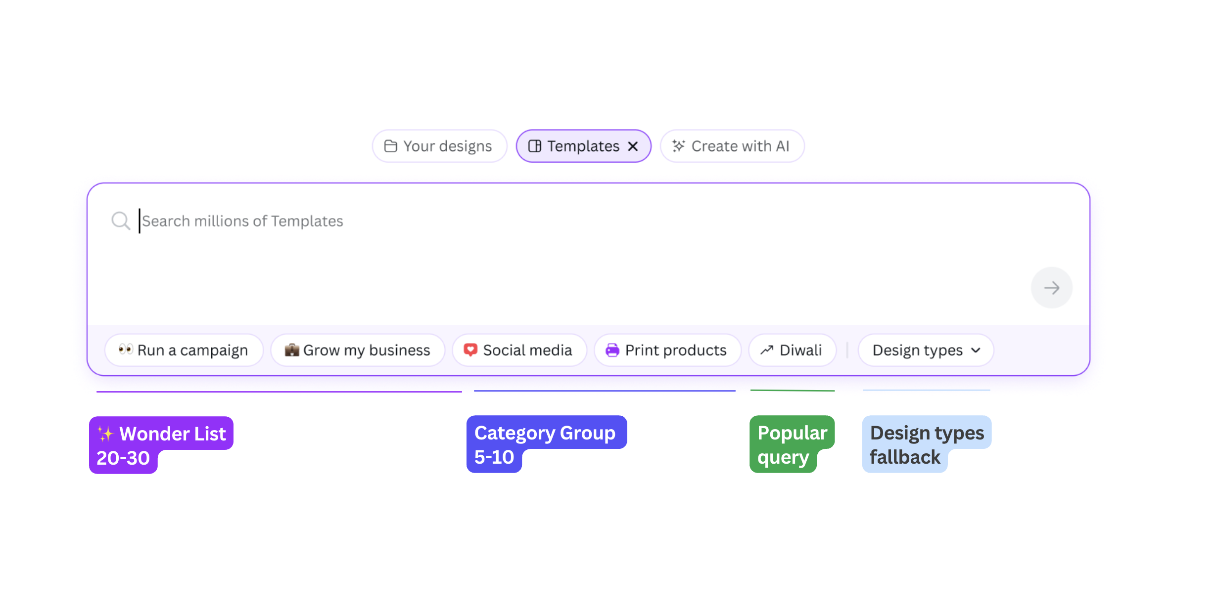
fitlering definitions
before and after
what I learned
thinking in systems is crucial
beyond components. beyond screens. how everything connects, that's the work.
education, education, education
ai needs to explain itself simply and openly. less magic, more clarity.
consistency matters more than it seems
small differences across surfaces led to big confusion. aligning things early brought clarity.
users don't follow the map
tabs, modes, prompts — people mixed them up all the time. real usage is messy.
tiny patterns, huge impact
pills caused more debate than full features. every detail shapes the journey.
ia is the hard bit
this wasn't just a design challenge — it was a system problem. untangling it meant thinking wide.