Cezanne HR was a fast growing, globally relied upon platform, that boasted a lot of features, but its interface hadn’t kept pace. The information architecture and workflow were extremely complex, navigation and templates were outdated, and users struggled with inconsistent flows and visual clutter.
Over a year, I led a full-scale redesign grounded in extensive research and testing. We modernised the UI, improved usability across 100+ screens, and delivered a faster, cleaner experience that better matched how people actually used the product.
14 months
Time
6
User Tests
100+ screens
Features
web, tablet, mobile
Platforms
my role
- led redesign from discovery to delivery
- ran generative and evaluative research across user types
- mapped task flows + identified key pain points
- restructured navigation and system architecture
- built responsive, component-based ui
- tested designs through a/b tests + interviews
- collaborated with r&d, engineering, qa, and sales
- contributed to front-end dev and bug fixing
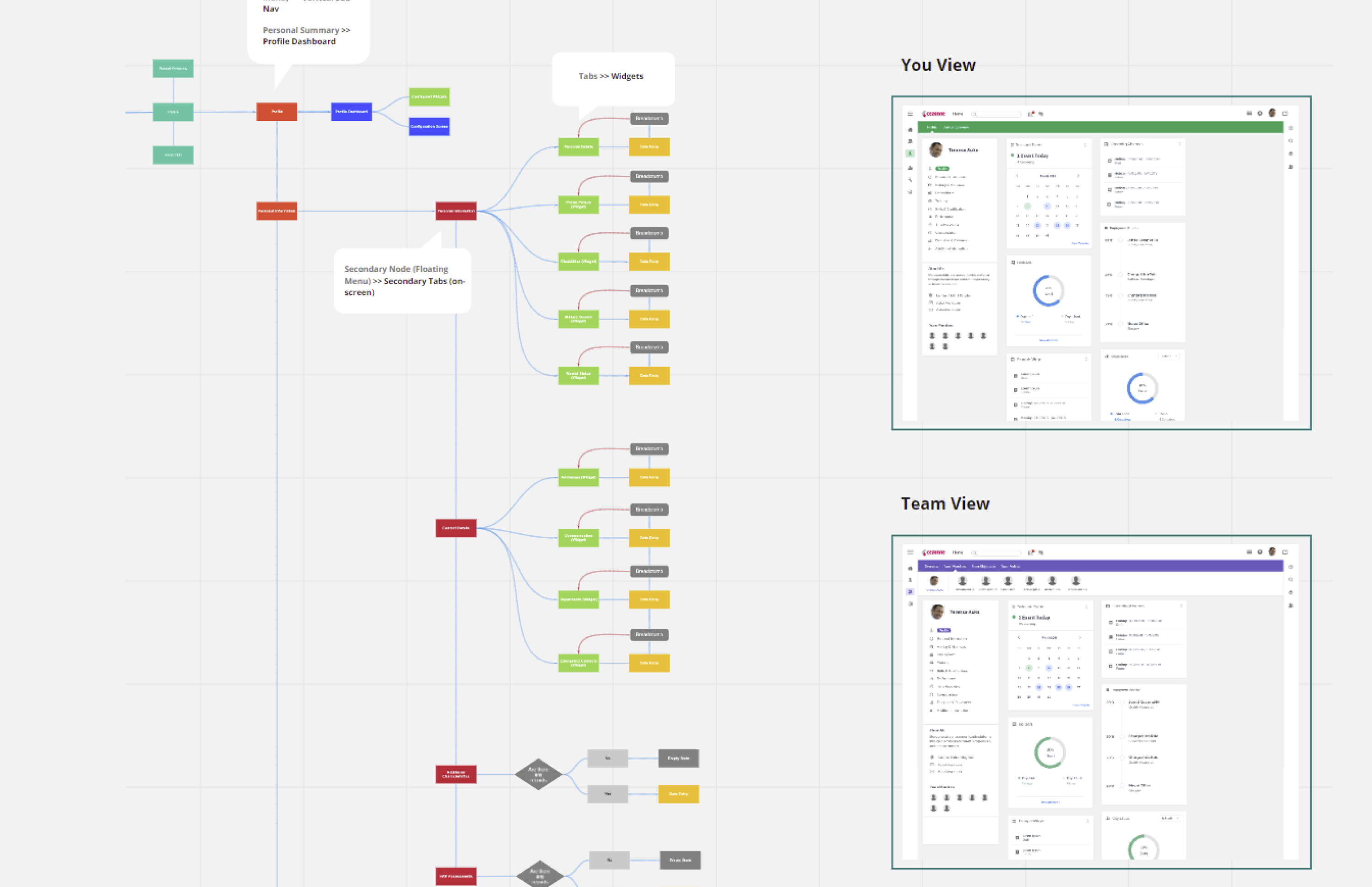
how it works
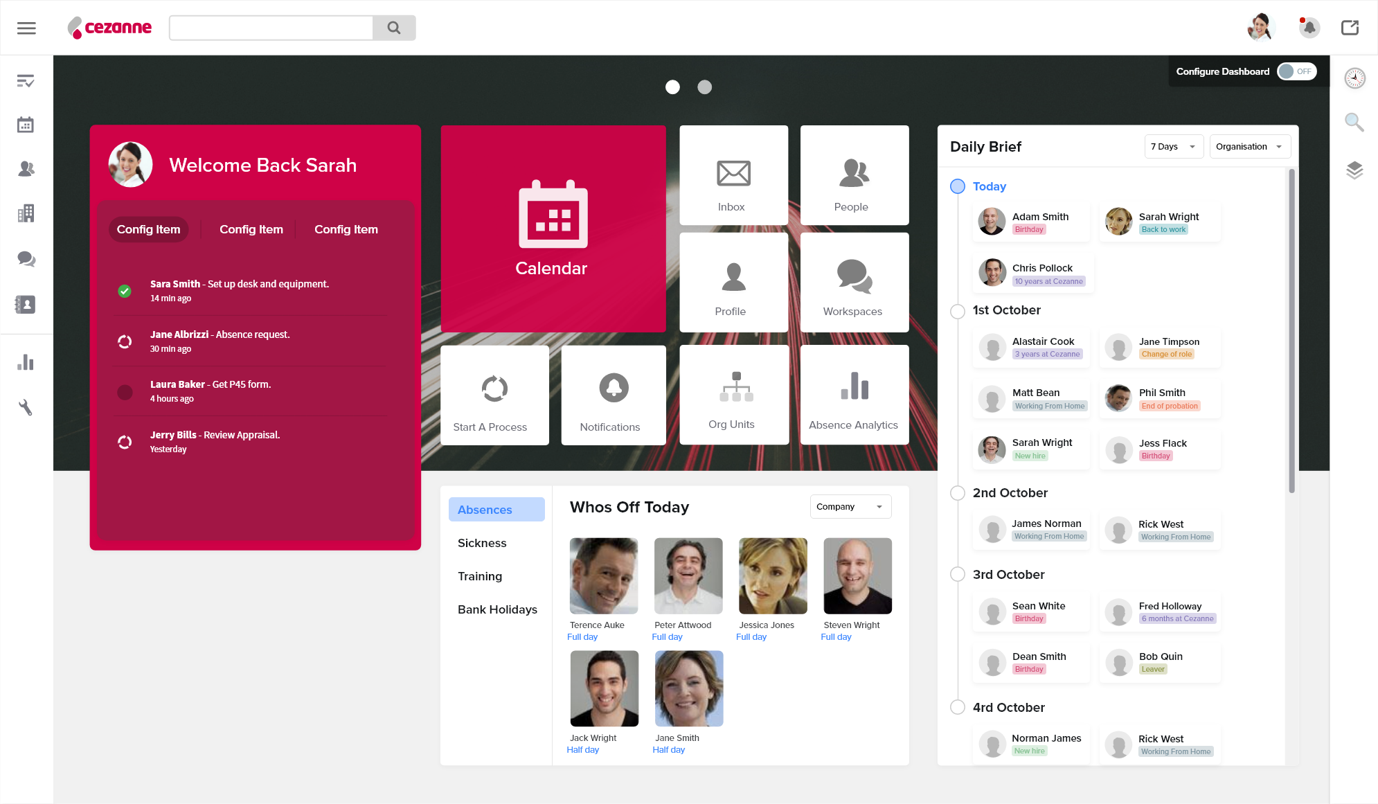
navigation overhaul
replaced the overly complex sidebar with view-specific navigation, progressively revealing content based on user intent.
user config + theming
introduced personalisation, dashboards, and branding options.
visual simplification
reduced noise, added spacing, unified look + feel through minimal, modular ui.
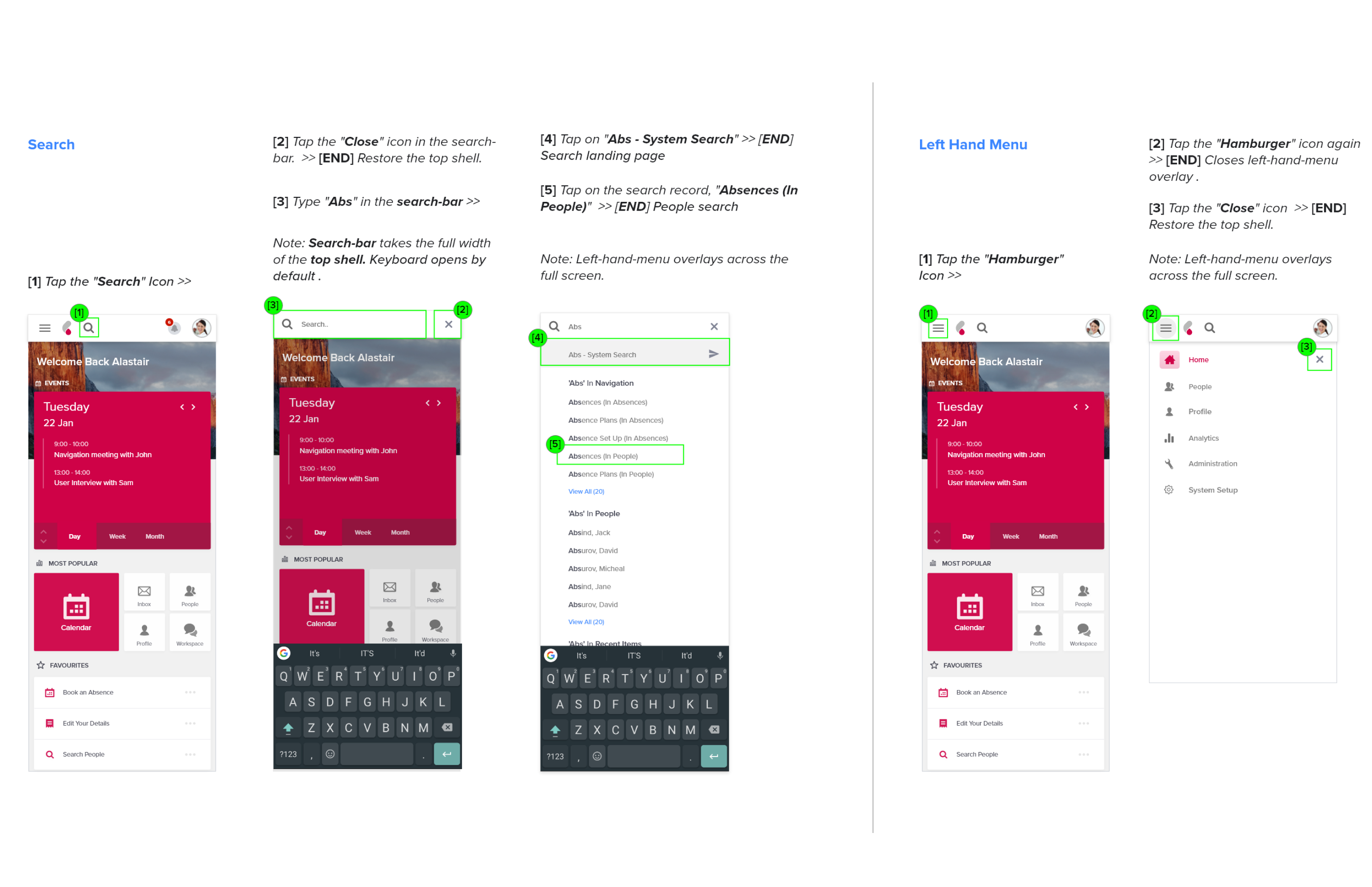
mobile-first thinking
designed for every device and use-case — not as an afterthought, but as a core requirement.
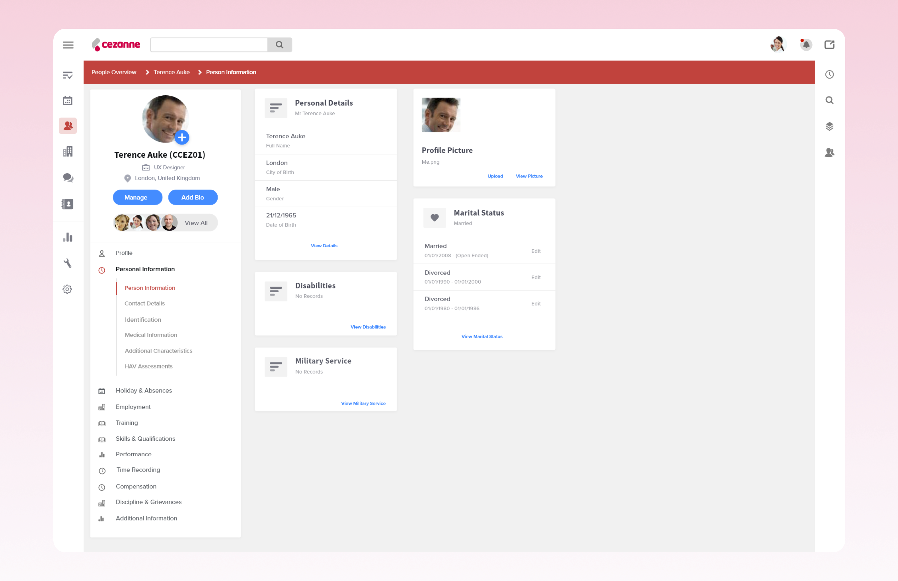
mental model mapping
learned how novice and expert users think, and designed for both.
modular system thinking
shifted design + engineering towards repeatable, flexible ui patterns.
simplified flattened out navigation
pay-as-you-go pricing and instant credit system
global carrier network and custom caller id
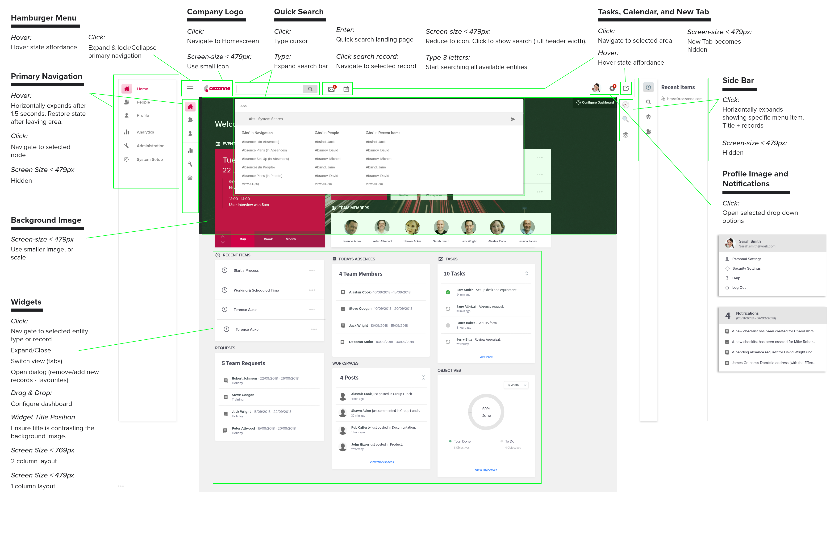
chrome and navigation
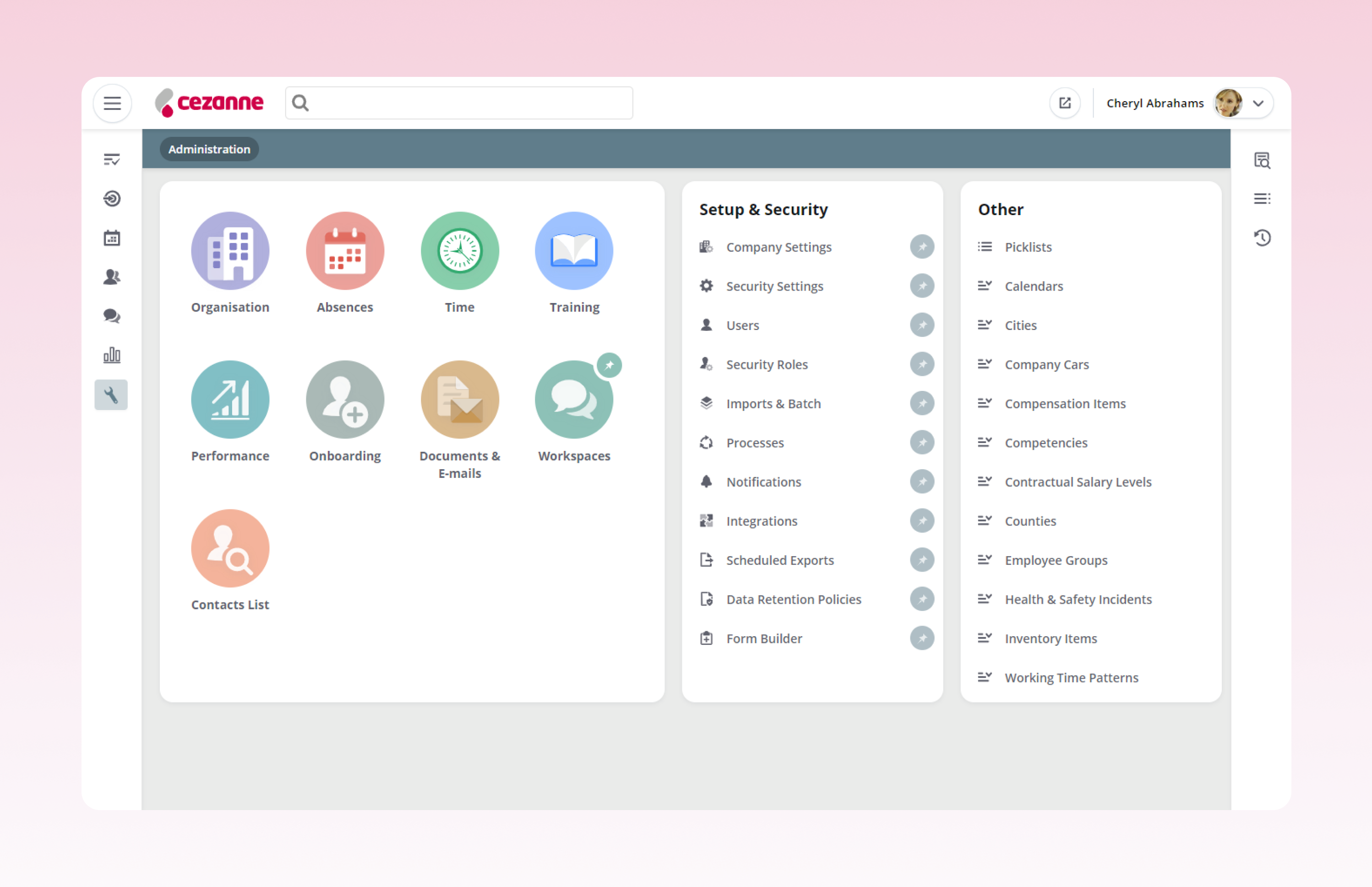
modular configuration and branding
what I learned
simplifying what people are used to is hard
people adapt and learn to live with complexity, which made unwinding it even harder.
understand legacy before fixing it
existing use cases reveaed more about user behviours than our orginal assumptions. start by listening.
power users want speed, new users need signposts
one size doesn't fit all. shortcuts and scaffolding must coexist.
design systems save time
consistency compounds. saving time on ui decisions let the team focus on the bigger picture.
good design sells
the redesign didn't just help users — it helped close deals too.
alignment unlocks scale
working across r&d, sales, and support provided a cohesive vision and helped everyone come together.